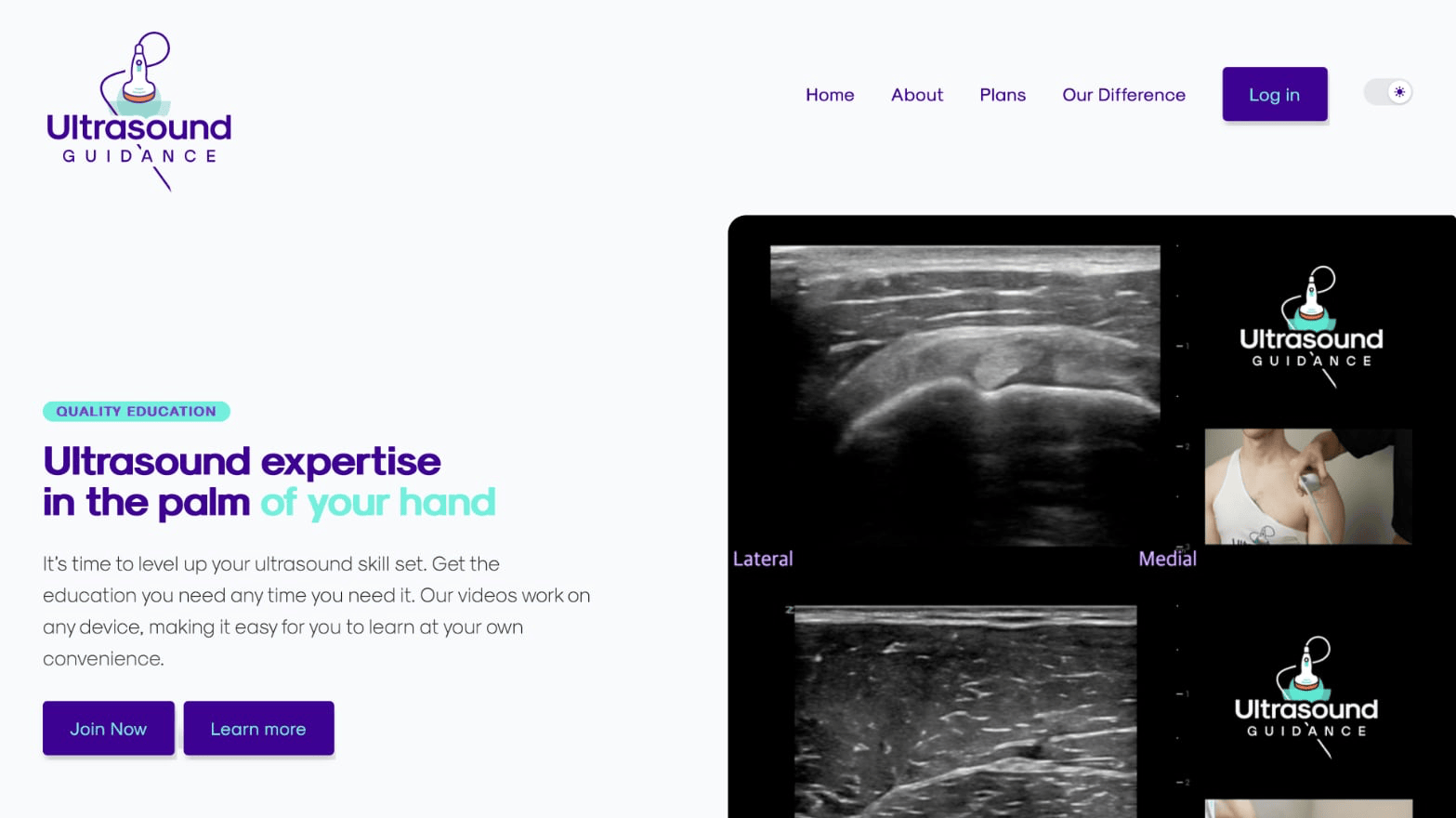
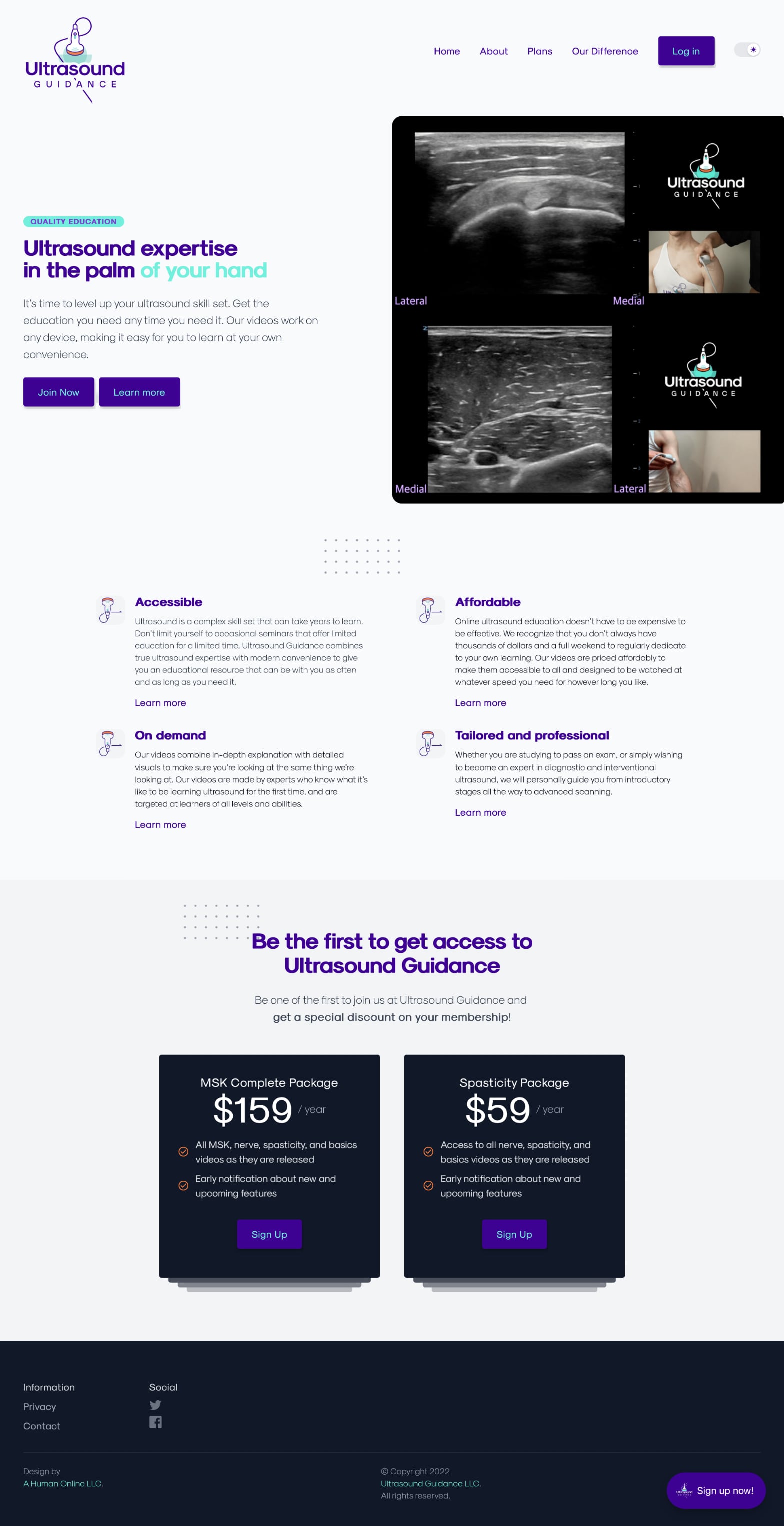
Ultrasound Guidance
Two humans wanted to provide high-quality ultrasound education. The current options weren't affordable, easy to find, or good enough.
Both doctors, both named Alex. They laid out what they wanted, what they already had, and what they didn't.
I took a lot of notes. I asked a lot of questions. There were Zoom meetings, unplanned cat introductions, and plenty of emails that started with "Hi Alex."
They wanted something that could scale. Something easy to use, with a clean, modern design. The architecture had to be intuitive and easy to navigate. This was content for professionals, and it needed to look professional.
They had a brand identity. They needed a site that could live up to it—and the vision they shared.
What I provided
-
Information architecture. Taxonomies! Content models! What kind of stuff are they putting in, what do they need, what don't they need, and how to organize it.
-
Layout and CMS configuration. Where that content goes on the page, how to help users navigate it, and tweaking the engine that powers it.
-
Deployment and maintenance strategy. It's built and tested. Time to make it live, and time to keep it live.
It went live in January 2022. The Alexes have their hands full running it, and I'm super happy with how it turned out.